Key takeaways
- Power BI makes it easy to turn raw survey data into clear, interactive dashboards that reveal trends and insights at a glance.
- By connecting your data source, cleaning responses and using visualisations like charts and slicers, you can uncover patterns and share results in real time.
- Start building your first report today to make data-driven decisions and present survey findings with impact.
When creating surveys, you want to be able to show the results easily and meaningfully. This makes it easier to gain actionable insights and key takeaways.
Fortunately, using Power BI for survey data offers real-time, clear insight, using any questionnaires your business undertakes.
This step-by-step guide to how we use Power BI to share our survey data easily and clearly.
Part 1: Creating the survey
Step 1: Create the survey using Microsoft Forms.
Alternatively, you can use Dynamics 365 Customer Voice, which is an enterprise-level feedback management system. While it’s not free, unlike Forms, it offers advanced features and can also integrate directly with Power BI.
There are many options available when configuring survey questions. We chose a few of the question types that were appropriate for our needs.
It is worth noting that Forms does support branching logic, so you can construct a more interactive survey displaying only questions that are relevant to the responders.
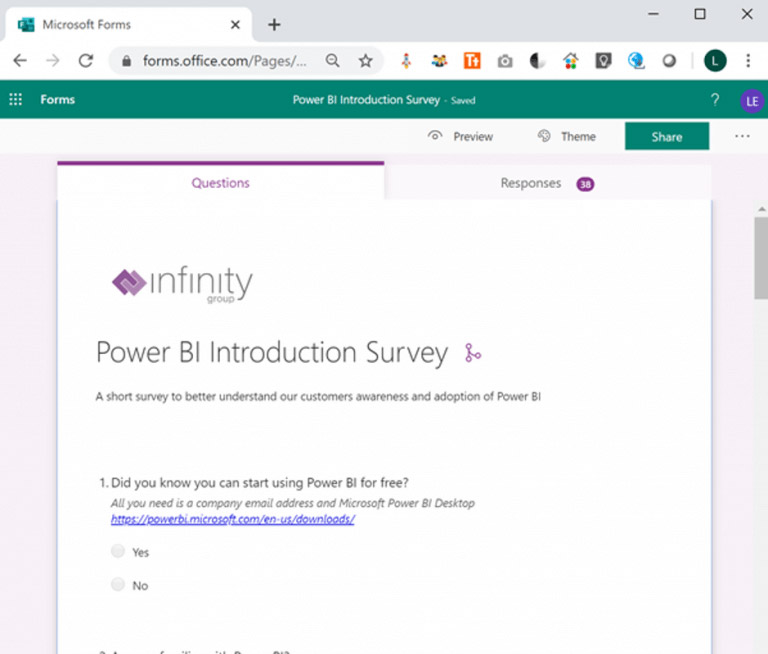
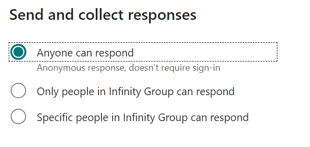
Step 2: We needed the survey to be publicly accessible so we adjusted the settings so anyone can submit a response. To do this, go into ‘Collect responses’ and select ‘Anyone can respond’.
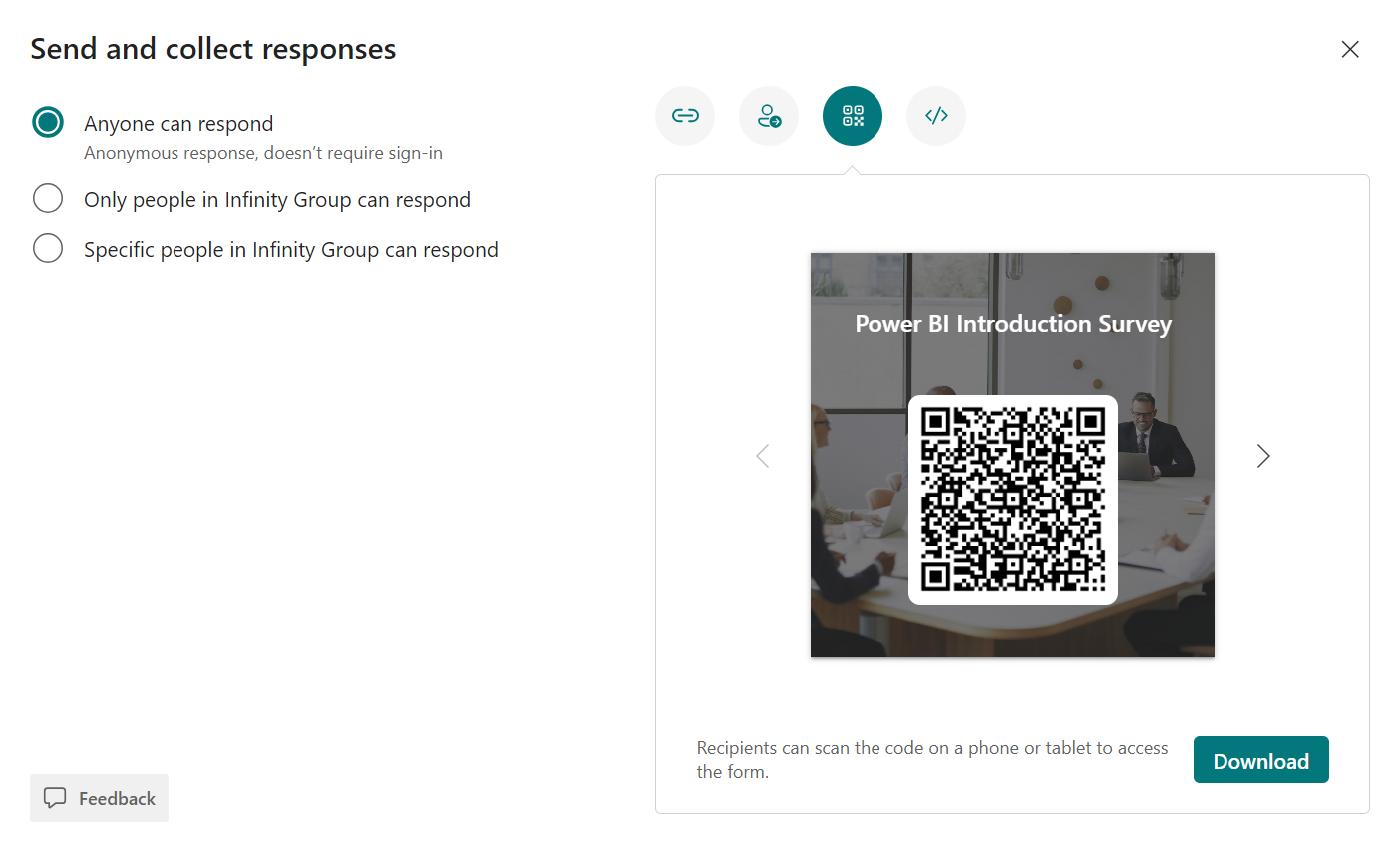
Step 3: Under sharing, get the link and QR code for later use in the Power BI report.
At this point, it’s worth mentioning that Forms does have response analysis built-in as you can see from the following screenshots. However, the response charts above are only available internally and we wanted to surface the results on a public facing webpage.
This is where Power Automate, SharePoint and Power BI come in.
Part 2: Storing and automating the data
Step 4: Prepare a central location to store the survey results.
We needed a location that was going to be accessible from Power BI. We chose a SharePoint list as it’s accessible from Power Automate and can be used as a data source directly from Power BI.
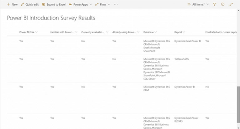
We created all the necessary fields in a SharePoint List. For maximum flexibility we made all the columns text fields. We can transform them as necessary using Power Query in Power BI later.
Here is a screenshot of part of the SharePoint List containing some results:
Step 5: Create a Power Automate workflow to push the results into SharePoint.
Power Automate was the obvious choice for processing the results of the survey.
A survey responses triggers this template flow, putting the results straight into SharePoint in the right format. This makes automating processes even faster.
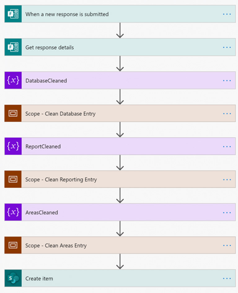
Step 6: Get response details.

Step 7: On the survey, there are text fields that are open for anyone to enter any data. Since we are going to process and redisplay that data in the resulting report, it makes sense to sanitise the data.
We chose to call a free web API from PurgoMalum to remove banned words. We applied this to each of the free text fields.
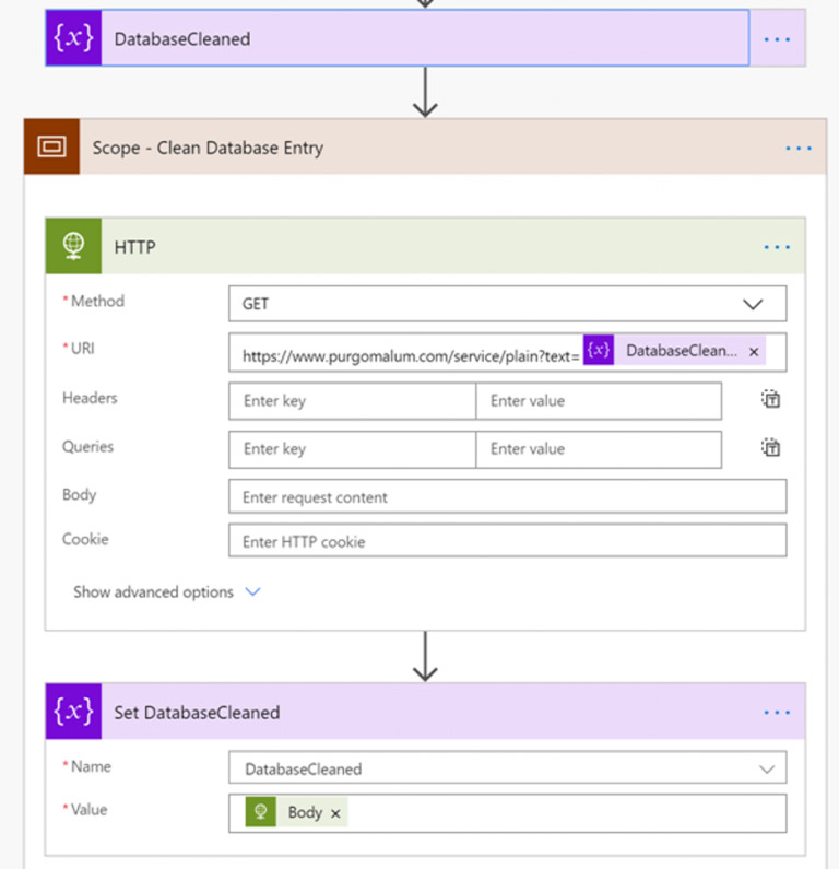
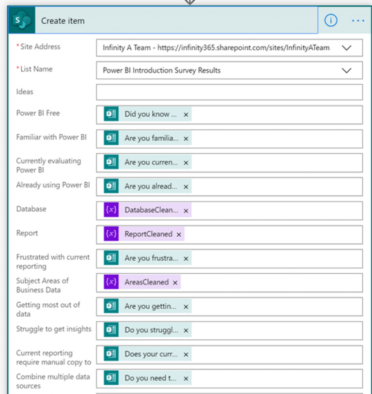
Step 8: The final step in the flow is to push the data into the SharePoint List, using the SharePoint Create Item action.
Part 3: Building the Power BI Report
Step 9: Create the Power BI report using the Power BI Desktop Application.
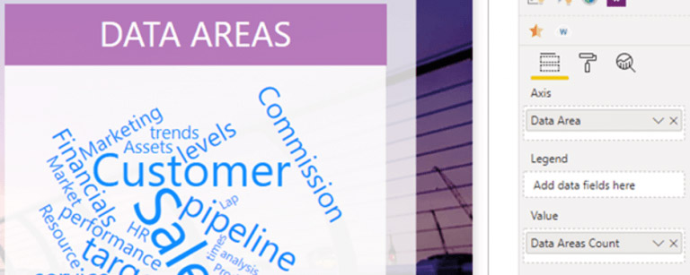
Within Power BI, there are plenty of types of reports and visuals you can use to share your data meaningfully. For maximum visual impact, we wanted to display the results of the free text fields in word clouds. Word Clouds are a free custom visual, which we imported from AppSource.
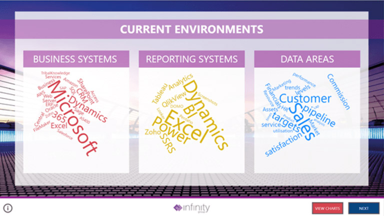
Step 10: Toggle visuals. The red button on this report uses ‘bookmarks’ to toggle the Word Cloud and Bar Chart visibility.
This report view is based on exactly the same data as the word clouds, just in a different format that gives a different perspective and allows a greater understanding and comparison of the responses.
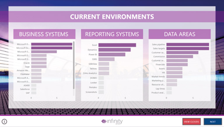
Step 11: Apply your company branding.
You will have noticed by now that all visuals in Power BI have the ability to be customised to match your corporate image. All backgrounds were created by exporting PowerPoint slides to PNG files. All images were downloaded from Pexels.
The statistics page is just a matrix showing each of the measures. However, many people do like to see a list of figures, so we’ve included an example of this below.
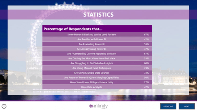
Step 12: The measures are calculated as follows. This was the only DAX needed for this report.

Part 4: Getting data into Power BI
Step 13: Next, we retrieved data from SharePoint using the SharePoint connector. Connectors make it very easy to consume data from various data sources. There are many connectors to all sorts of data.
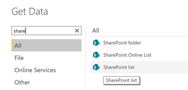
You will need to transform the data to get it into a good shape for the report.
For example, if a question in the survey isn’t filled in, the SharePoint List field will contain the value ‘no input’. Fortunately, it is very easy in Power Query to replace those values with something that makes more sense to your data model.
Step 14: Add custom sort order columns.
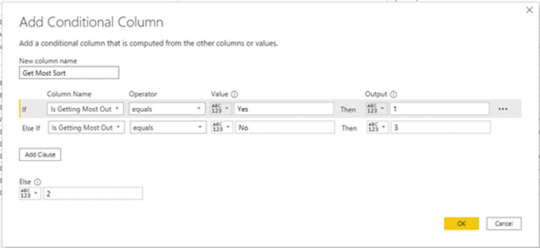
You can now sort bar charts in a custom sequence, as follows:
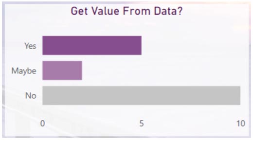
Step 15: Next, split the data for the word clouds into their own tables using the following transformations:
- Split column by delimiter
- Unpivot
The raw data from the survey for a multi-select option question looks like this comma separated list.
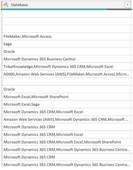
Step 16: In Power Query, we used the transform ‘split by delimiter’ to put each item into its own column.
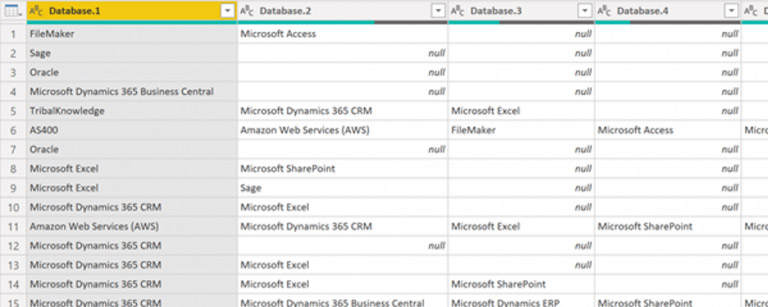
Step 17: Then, finally transform the multiple columns into separate rows of data with the ‘unpivot’ transform.
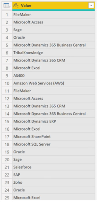
Step 18: This data is now in a fit state. You can place in the word cloud visual.
Power BI Mobile for survey data
Another key feature of Power BI is the ability to show reports on mobile devices. It’s very easy to create a mobile friendly view. Here’s a short step-by-step guide on how to do it.
Step 1: Click on Phone layout view.
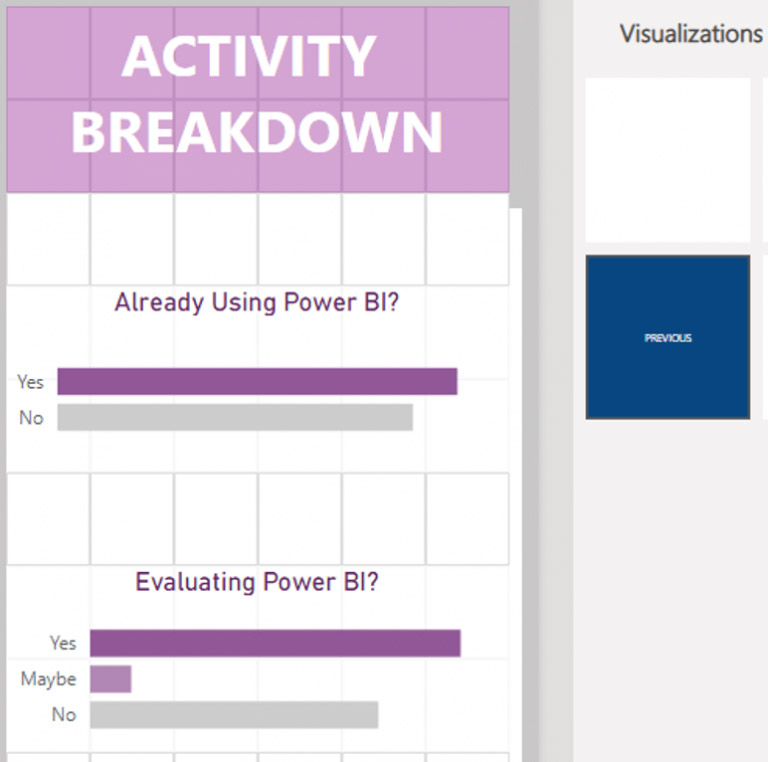
Step 2: Drag the previously created visuals onto the phone canvas.
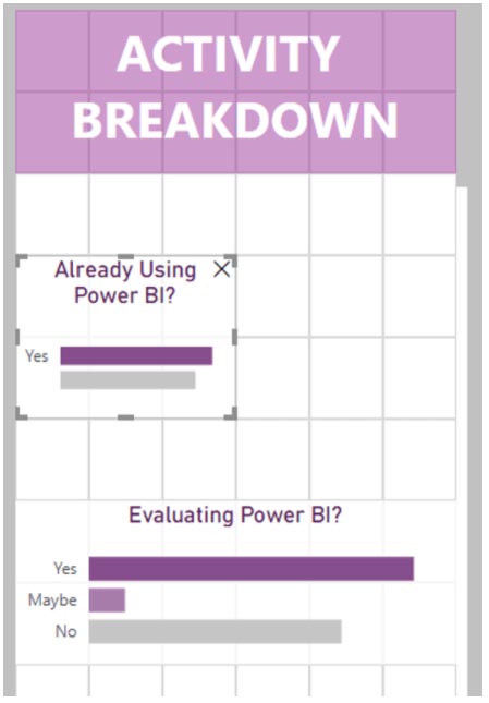
Step 3: Adjust the size of the visuals. This is very intuitive, so should be simple to do.
Step 4: Publish report to Power BI Service.
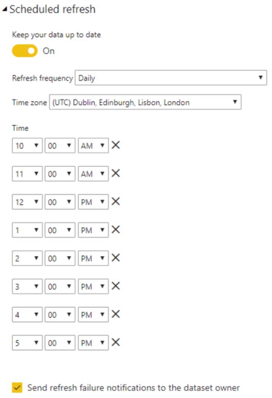
Step 5: Configure data refresh schedule.
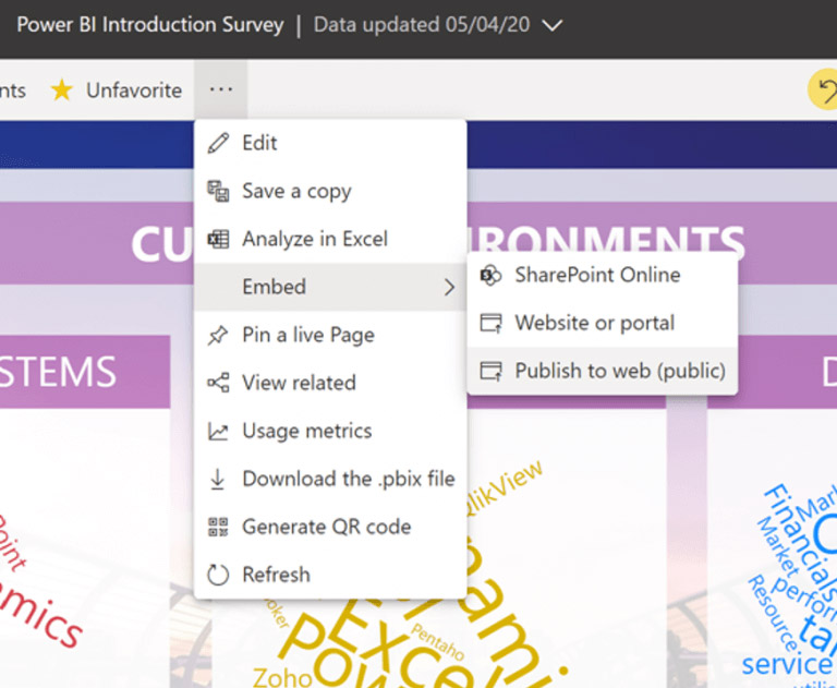
Step 6: Publish the report to the web.
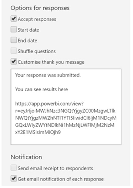
Step 7: Close the feedback loop from survey to the report results
Step 8: Update the survey thank you message with the link to the live report
Conclusion
There you have it: this is how you can use Power BI to share survey data! And surveys are just one type of data you can bring to life. You can find out more about how to use Power BI effectively in our guide.

